Posts

Showing posts with the label Photoshop

Project 5 Final: Gemini Virus Novel Illustrations

Image
I have illustrated several aspects from Wil Mara's novel, The Gemini Virus  (2012), a very graphic and detailed novel about a deadly virus that started in a small American Town, then quickly spread throughout the surrounding cities and states. Because of the amount of disgusting detail in the novel and with the very real Coronavirus pandiemic I thought I'd spare my classmates that amount of gore.  I chose images that stuck with me as I read that I think would give the viewer enough information to interest them in possibly reading The Gemini Virus , themselves. So, I guess it's kind of a promo image. I wanted to show part of my process by showing the copyright/royalty-free images I used from Pixabay.com (left side) and the end results of my Photoshop Illustrations (right side).

Project 5: In-Progress with Layout

Image
I still haven't fully decided what the other two images will be, but that's what I'm working on today and the rest of the week. When I signed-up for this digital imaging class I had a goal of learning new techniques to become a better illustrator. I've had a lot of fun with this idea and I'm excited to continue this illustration page. I hope to post again soon!

Project 5 In-Progress: New Ideas!

Image
Hey Guys and Gals! After Ed's comment and a conversation we had I think I'm going to work on a few images and lay them out into either a graphic novel panel/page or a promo poster for the novel which would express a few scenes from the story instead of one scene. Updated Image: First of all, I added the patient on the hospital bed and have included some reflective light from the monitors. I have also desaturated the red linen cart and blue oxygen tank that are close to the observation window, as those colors were drawing attention away from the patient and the observers at the window. One thing to note in this scene is that in the book the patient is covered in full-body puss-filled vesicles and blisters. She is described to be covered up to her neck in the hospital blanket, which has wet yellow spots all over from the bursting blisters (I warned ya'll it was graphic). Before going out of her mind the 7-months-pregnant woman tried to cut her baby out in order to sav...

Project 5 (Final Project): Progress

Image
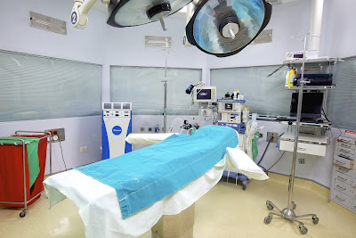
I decided to work on the illustration for The Gemini Virus, as I didn't get any feedback since my last post and I felt strongly about this story. I looked up hospital rooms on this royalty free image site, Pixabay.com, to set a base for my illustration. Here's the original image: Here's my progress on adjusting the image and creating an illustration:

Project 5: Illustration Idea In-Progress

Image
Please see my previous post introducing my idea on book illustration before continuing to this post. I did a little sketch on the quote I was thinking about using to form an illustration idea. I don't know if I'll actually use text in the illustration, at all, but I just wanted you guys to know what's supposed to be going on. I kind of want to leave a little imagination to the viewer -- but maybe I shouldn't? And I don't think I'll go full-on cartoon-y, either. This is just a quick digital sketch. I might also make the POV from the doctors behind the glass so we can see the woman better. I'm not sure yet. Ideas are welcome. ... I can also do a children's book illustration that is more heart-warming and gentle. I've worked on this little guy/gal (sex unknown and supposed to be ambiguous) for one of my clients in a freelance gig I have for a children's book series. What would you guys rather see me focus on for this last project? Wa...

Project 5: Open Project Ideas

Image
Hey gang. My idea is to make a book cover or book spread illustration, perhaps for a children's book, or a more mature genre. I've been reading a story about a viral outbreak called The Gemini Virus by Wil Mara. Though it's a very graphic novel with quite disgusting imagery described I've been very intrigued in thinking about what an illustration would look like, and thought it might be interesting to make one of my own. I have made little quote images for The Gemini Virus, as well as an image I Photoshoped of myself  having the early stages of the virus for Instagram. See below.

Project 4: Progress Update v4.3

Image
Here's my update! I took away the masks and triptych framing, allowing the background colors to blend together giving a softer transition both literally and metaphorically -- as babies transition through development very quickly and seamlessly. I also used one version of my hand-written haiku repeated in the background to make a (hopefully subtle) texture, and to emphasize the message. I feel that the message is important for viewers to consider. I understand some messages work better without "instructions" or precise direction and emphasis, though I thought it would be another design element that would nicely add-to the composition. I also added more to the blue and yellow backgrounds and added a new foot on the middle baby image with my Wacom tablet. For my next set of critique comments I'd like to know do you feel the texture pattern of the haiku works as-is, should I modify it, or should I get rid of it? Also, do you feel this composition works well without...

Project 4: Updating Progress

Image
Although I thought the last version was pretty resolved I started adjusting the elements, taking away the triptych frame and the open space where the haiku was typed. I used the Wacom tablet to hand-write the haiku and adjusted the size and position of the first and second images. I also added a bit of black outline to the middle and last image to make them less photorealistic. I had natural media filters on them to make them look like paintings in the last version, but I guess at a low resolution on a screen it might have been harder to tell. This is IN-PROGRESS, and I am trying to think of how to further develop and resolve this latest version. Part of me wants to "complete" the ultrasound image that I drew, but I think a bigger part of me wants to leave the hard edges. Below is the original image. At that stage of development the technician could not fit the entire baby in the view because he had gotten bigger. Earlier ultrasound images don't have such a cute baby...

Project 4: In-Progress & First Final

Image
This post is for an in-progress critique. I feel that it is pretty close to complete / resolved. I decided to keep the open space on the lower left panel and write a haiku about the images. Growth of life can be Full of unknown and known Blessings are made clear I used natural brush filters and effects to make the middle and right images look like a painting, and then used my Wacom tablet to hand-paint the background and around the figures. I also used the Wacom tablet to completely draw the Ultrasound image. I used yellow in the middle panel to represent the fear I felt at and right before the birth due to the high-risk pregnancy I had, as well as the emergency c-section delivery. I chose the use of the blue color for the right panel to represent the calm and good health of our present day.

Project 4: Visual Sequence Narrative

Image
For project 4, the Visual Sequence Narrative , I immediately thought of comic books and animatics / storyboards. Though this was my first thought I stopped myself and asked a hard question: What matters to me? What is important? What tells a good story in my life? I have two children, and both pregnancies were difficult at times. My youngest's birth, though, was a very scary and difficult experience. I had developed a condition where my blood had become toxic and almost shut down my kidneys and liver. I had to have an emergency c-section. Sparing the details, I wanted to use the classic triptych design to represent three stages of my son's life: in the womb, first born, and present-day. My boy is a healthy and active two-and-a-half-year-old with a wonderful and funny big sister. Below are the beginning ideas for my triptych narrative. My goal is to use photographs to reference and to digitally illustrate each image in Photoshop using my Wacom Tablet. In version one (v1) I...

Project 3 Final: The Cyclical Nature of Things

Image
Cyclical Nature  of Things The theme of this work and composition was my personal traveling routine and transition. As stated in the last entry, on my daily walk I would always stop to admire the beautiful and ever-green moss growing on the branches of trees, mailboxes, and fences as I walked down my neighborhood street. Because it was the highlight of my morning walk I wanted to place that image front-and-center, making it the focal point of my composition. My composition is made with four key images: The mossy branch, the street, a tree I pass on my way to the art building, and the side of the art building I enter for most of my classes. Some additional elements I've added are the sky-blue resting space at the bottom of the image, the streaks of white that can symbolize clouds, shine, or water, and a rendered tree to help the transition between two images. One of my main goals was to integrate the images to form seamless or nearly-seamless transitions. I was pleasantly...

Project 3 In Progress

Image
For this project I want to convey my daily traveling routine. Because I walk down a fairly long road to get to my bus stop and admire the beautiful moss and sunlight I thought I'd make that the highlight or focal point for the viewer.  This is just the beginning progress / process of this piece, but I hope to make almost seamless transitions between the various scenes above and below the moss-covered branch. In this close-up screenshot you can see the effect of the drawing and painting filters I've added. From far away it would look like a photo, but up-close you can really see the detail of the artistry. I hope to do some "hand-drawing" with my Wacom tablet onto the image, as well. 

Project 3: The Cyclical Nature of Things

Image
Project 3: The Cyclical Nature of Things  The following images reflect my interpretation of "The Cyclical Nature of Things" by showing my cycle of daily travel to and from school. I chose not to present images of traveling on the public bus because I did not want to impede on the privacy of others and use their image in my personal works. There was a particular tree I had noticed as I walked towards the Schaefer Center that had a few leaves on a particular branch that were barely hanging on. On several consecutive days I would take a photo of those leaves to see if anything significant would change over time. I found the nature around me in the spring season was very interesting and beautiful, despite the lack of full leaves.

Project 2: Destroy the Icon (Houdini in Chains)

Image
Project 2: Destroy the Icon For project 2 we are to scan an iconic image and attempt to create at least four compositions using that image as well as a scan-o-gram of textures to manipulate the image enough to where it is still somewhat recognizable, but legal to use. I chose to use an image of the great Harry Houdini in chains before performing a trick to escape. My idea is to relate Houdini's anxiety and feelings through creating various versions of himself around the central figure. In creating several patterns and textures I try to indicate his stress and the social and mental trends Houdini had gone through in the later part of is life.